In James Little’s five abstract canvases in oil and wax exhibited in the marble-clad Modernist lobby of 499 Park Avenue (on view July 20 through December 1, 2020), he explores the nature of contradiction with mathematical determination. The whole point of mathematics, in a certain respect, is to simplify existing situations and, in more obtuse terms, resolve the deeper nature of various interactions, whether they apply to nature, crowd behavior, societal trends, etc. Is this the point of visual abstraction in art? Absolutely not. But abstraction, and in particular pure geometric abstraction, allows us to recognize certain fundamental concepts in terms of visual metaphors and how we apply them to more fluid ideas about our humanity. This is what I think James Little is up to: his paintings feature contradictions between color and form, perfection and accident, and idea versus image.
Little refuses to back down from his deep-felt love—maybe even obsession—with Formalist discourse. Whether we choose to inject a social subtext is mostly left up to us, though the painter does guide the viewer with his enigmatic titles. Titles like American Dreamers Denied and Legacy of Thieves and Pundits hint at an alternative interpretation beyond a Johannes Itten or Josef Albers-like fixation on the interaction of colors. Jack Whitten, a fellow Black artist who was a generation older than Little but similarly born in the deep south, also named various works in such a way as to imply a deeper political reading beyond the pure abstraction of the work: Whitten’s Black Monolith series, which features individual memorials to luminaries such as James Baldwin and Barbara Jordan, is one such example. The use of pure abstraction by Black artists to directly convey meaning, especially in the context of the civil rights movement, is fascinating and deserves book-length consideration. From the 1930’s onwards, realism was the style of choice for political messaging, and the use of abstraction by Little, Whitten, Alma Thomas, Stanley Whitney, Mavis Pusey, Al Loving and Sam Gilliam hearkens back to the more independent and radical combination of aesthetics, imagistic ambiguity and formal considerations of Constructivism and Cubism.
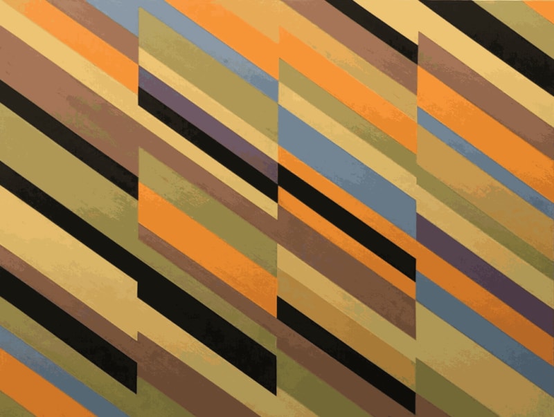
The shapes are at war with the colors—there is a vivaciousness to the polygons, hues, tints and shades in Little’s creations which brings to mind Edwin Abbott’s book Flatland: A Romance of Many Dimensions where the triangles, squares, hexagrams and even points and lines are similarly personified and animated. The geometric forms offer comforting repetition and pattern, something which the color palette actively subverts and denies. Straightforward progressions of stripes, as in American Dreamers Denied (2011) start off from the right side of the canvas, alternating in light beige and gray, but these stripes shift into a yellow, light green and light blue sequence that causes the eye to stumble—the stripes are frustratingly lost among the consonant adjacent colors. In Near Miss (2008) and Legacy of Thieves and Pundits (2009), we are faced not with stripes, but interlocking diagonals: the dissonant flickering of the complementary colors makes them inscrutable, and pinning down the intersections and alignments of the blocks of color, which seemingly should be simple in such clear-cut patterns, demands single-minded concentration. In Titian’s Cube (2016), Little constructs a diagonal mosaic of identical parallelograms. The colors he assigns each piece almost form a repeating color pattern. It’s just enough to convince the eye to scan this expanse over and over, trying to discern a safe regularity, but to no avail. These gestures are analogous to Jasper John’s word, number and map games—painting the word “Red” in blue paint, for example—but they also pull in the monumentality and directness of Carmen Herrera. It’s an intriguing and beguiling hybrid.
The crisp lines dividing the colors are heightened by the gooey thickness of Little’s wax-infused oil. According to Mario Naves in his introduction to the show, the artist grinds and mixes his own paints in a blender in his kitchen, and this care to craft yields deep meditations on the nature of color. In Picasso’s Funeral (2006) one has the odd moment of reflection considering the question of “what is blue?” where two meticulously invented shades of the color—on the left a bit more gray, on the right a bit more red—are presented for comparison. Thinking specifically about color theory while gazing at a canvas is rare, as is pondering the nature of line and the idea of separation. Little also toys with the concept of wabi-sabi in his work—just a bit—by allowing the ridges of his long careful brushstrokes to remain on the smooth matte surface of his paint. This thoughtful avenue for allowing imperfection also emerges in other details that express the hand of the artist: the lines are clear and concise, but again in Picasso’s Funeral, the points and intersections of the polygons in series are similar but not perfect. Little concedes that the narrative of the artist lies in these small inconsistencies: we can watch him solve the problems he has set for himself with these touches. While mathematics and pure abstraction can never be a straightforward guide to life, it can at times more deeply symbolize the currents and principles of political and social problems which lie far “beyond geometry.”
