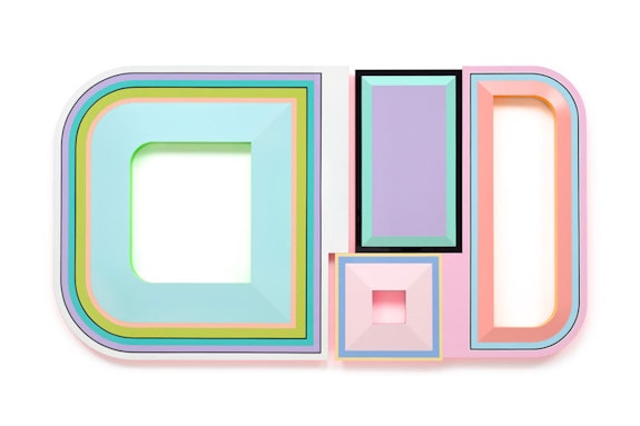
Beverly Fishman likes the look of Finish. No, not like Larry Bell and Helen Pashgian, artists associated with the Finish Fetish scene in LA in the 1960s. Though she may start from the same materialist impulse, she occupies her own territory. For starters those artists used glass, resin, enamel, and aluminum to make abstract paintings and sculptures in an effort to address the new materiality surrounding everything from car culture to consumer culture at large. Fishman applies highly saturated urethane paint to wood using geometric forms borrowed from the “neutral” design of prescription pills. In her world dualities abound. Her palette is as exuberant as it is clinical. These are referential paintings that look like hard-edge geometric abstraction—somehow they are both and yet neither. In her recent solo show Something for the Pain at Miles McEnery, Fishman introduces an empathetic reading of geometry.
Fishman began exploring the digital imaging of disease in the 1980s and 1990s. She is now concerned with the aesthetics of medicine. Works like Untitled (Pain, Pain, ADHD) (2022) combine three separate geometric forms to explore the positive/negative space within and around the painting. She paints a light teal, half-moon form with leaf green, bright yellow, cadmium red and black lines that outline the perimeter of the form. The half-moon’s center is cut out revealing inner detailing painted in hot green. It glows within. The half-moon butts up against a deep, teal circle on the upper right, which has a pale, pink center with cadmium red and black lines on the edge. The circle rests on top of a small, white triangle with a peach center cutout. Put together it all nearly mimics a corporate logo. Fishman’s color is coolly sophisticated, and her surfaces are high gloss. Both act as bait for the form, but her content does the talking.


